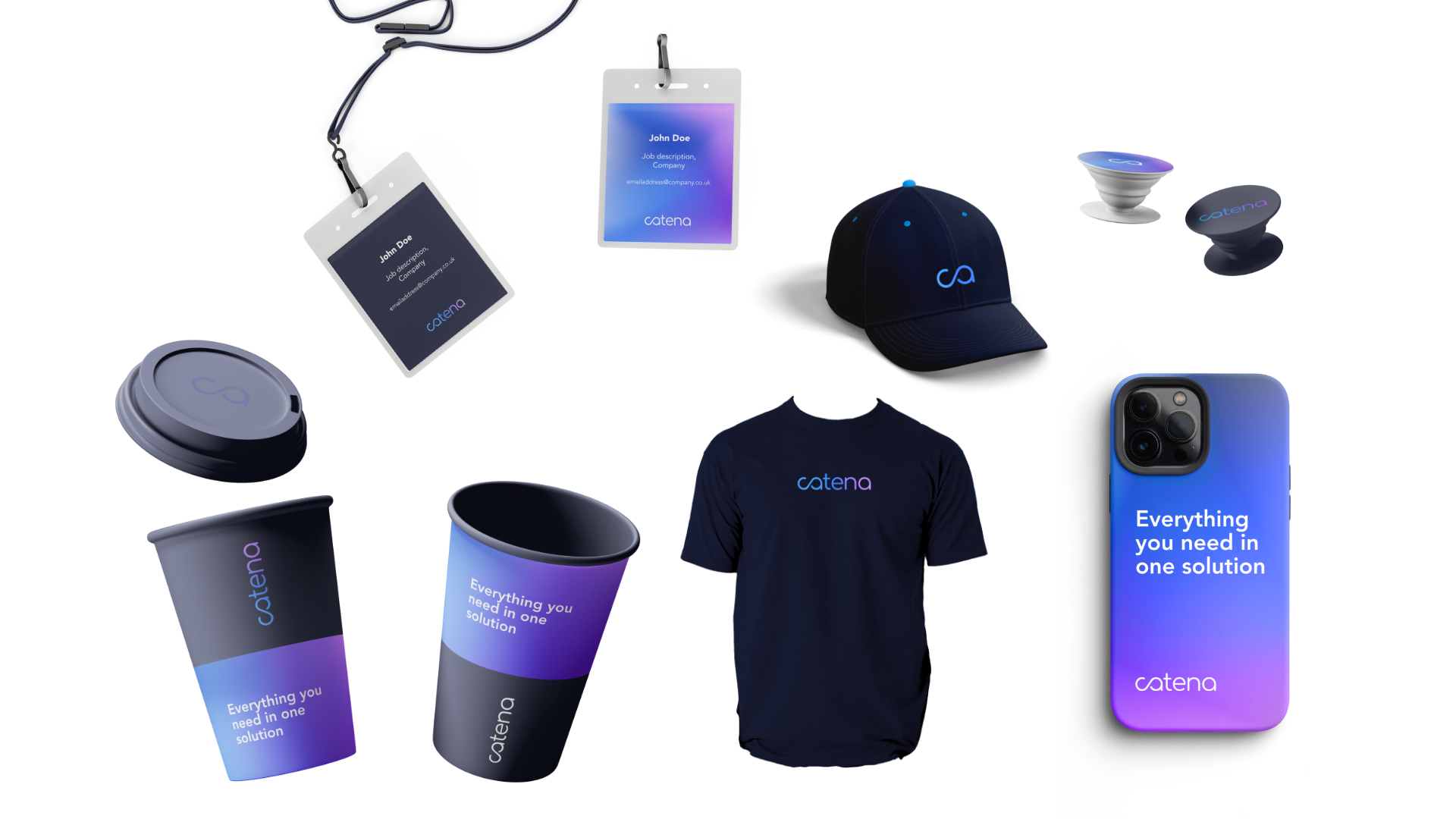
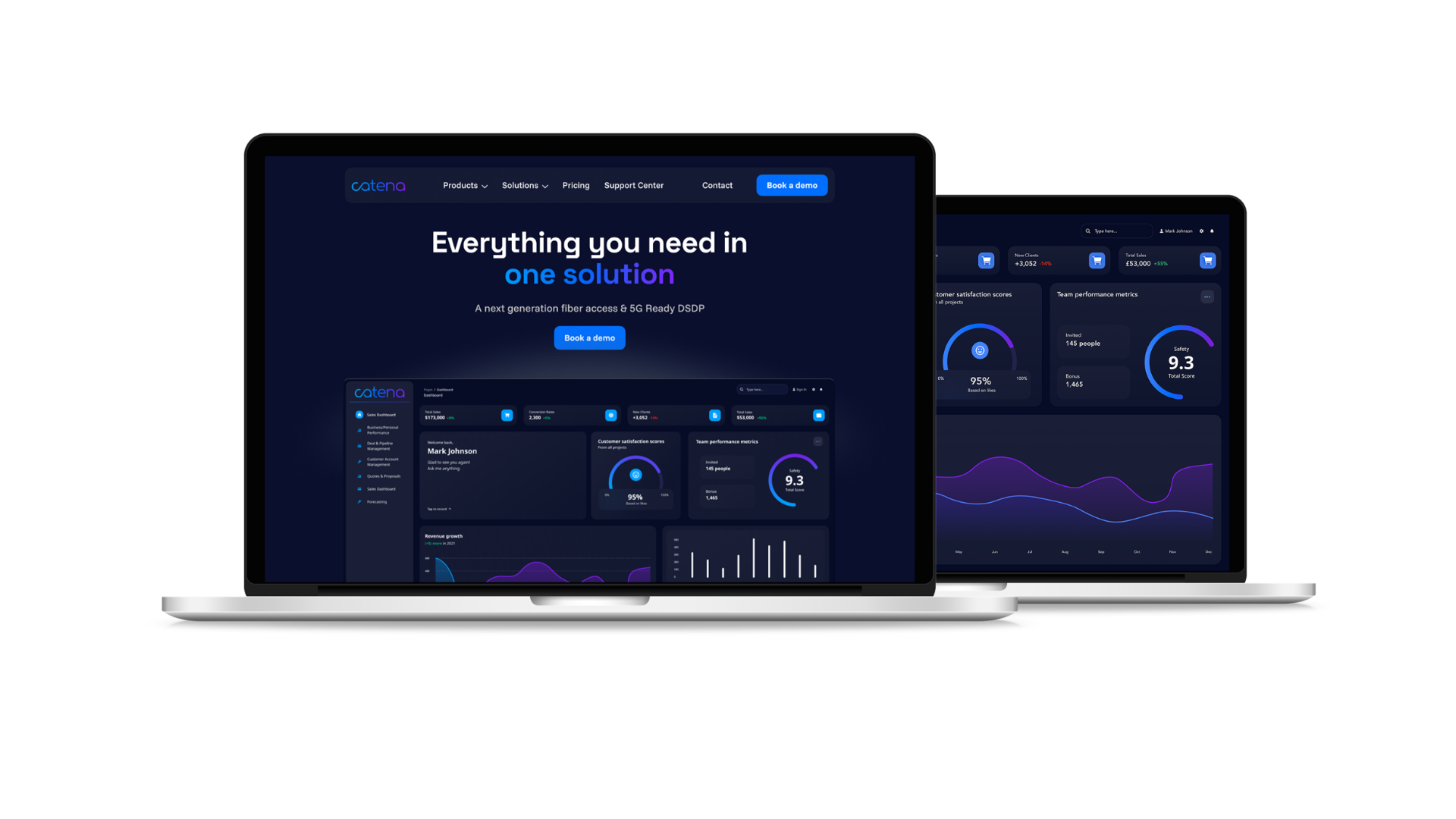
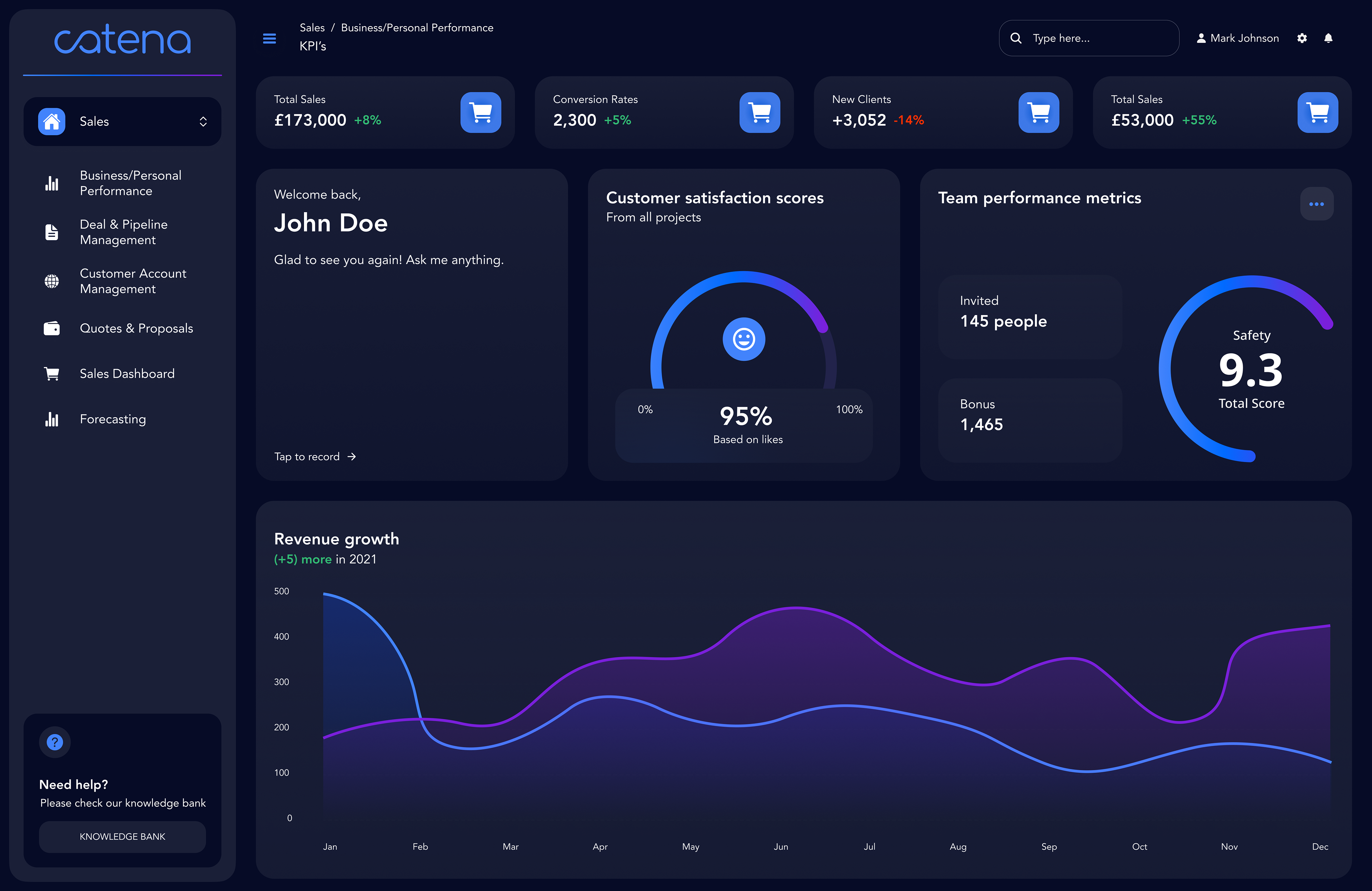
For Catena Cloud, I developed the final brand guidelines and translated them into a cohesive digital experience, contributing to the design of the dashboard portal and website while ensuring consistency, usability, and accessibility across all digital and print media.




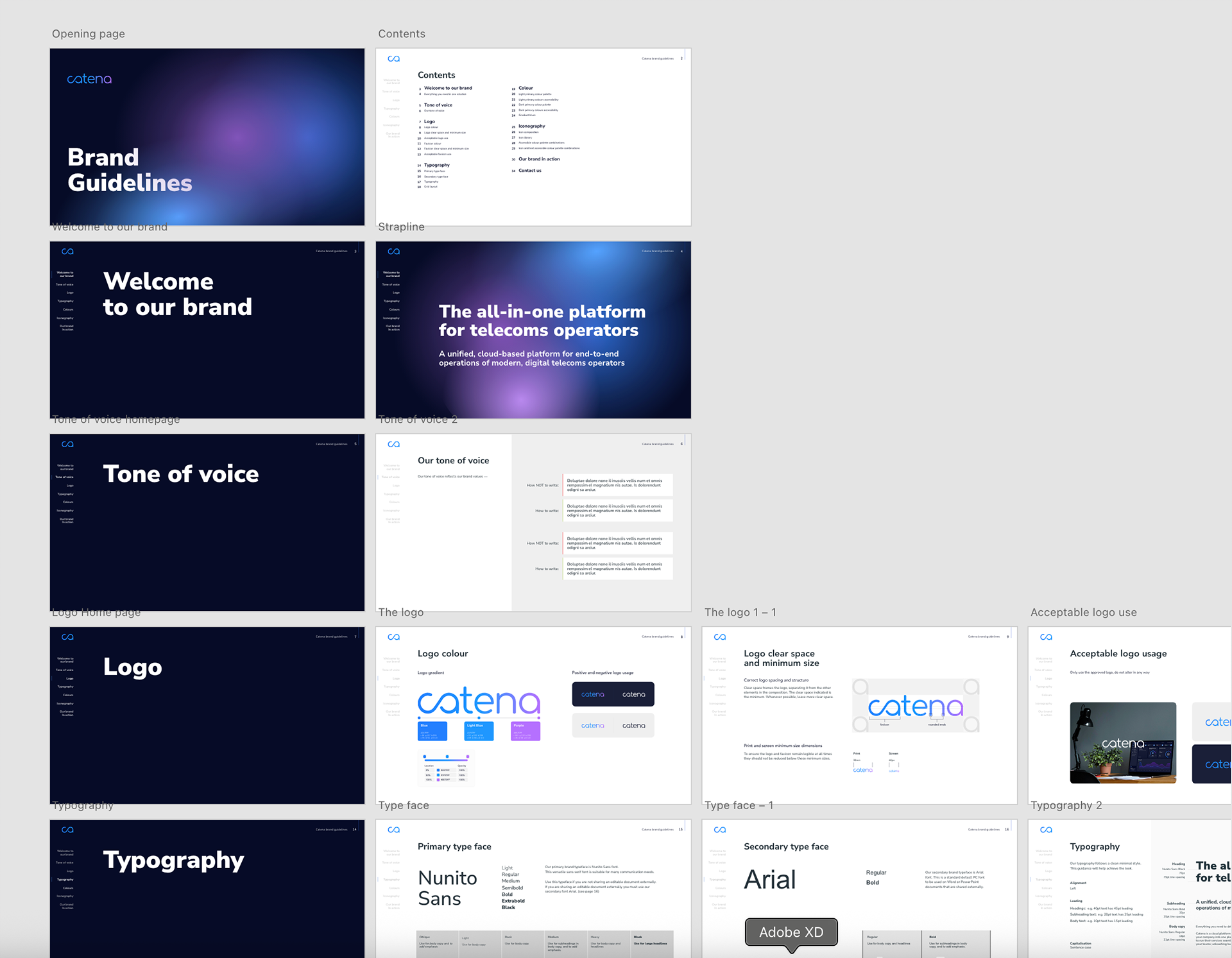
Curated and designed the brand guidelines
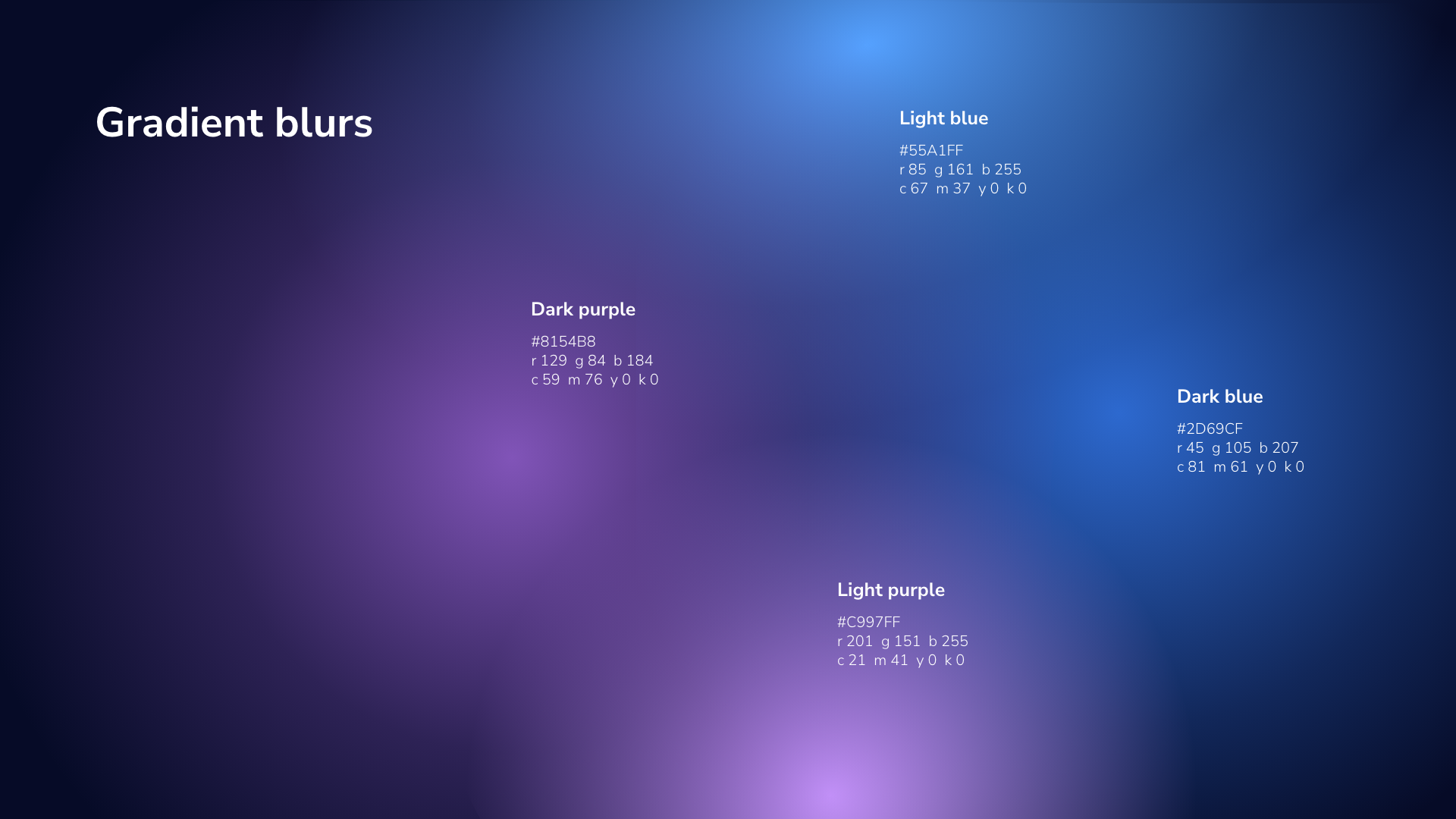
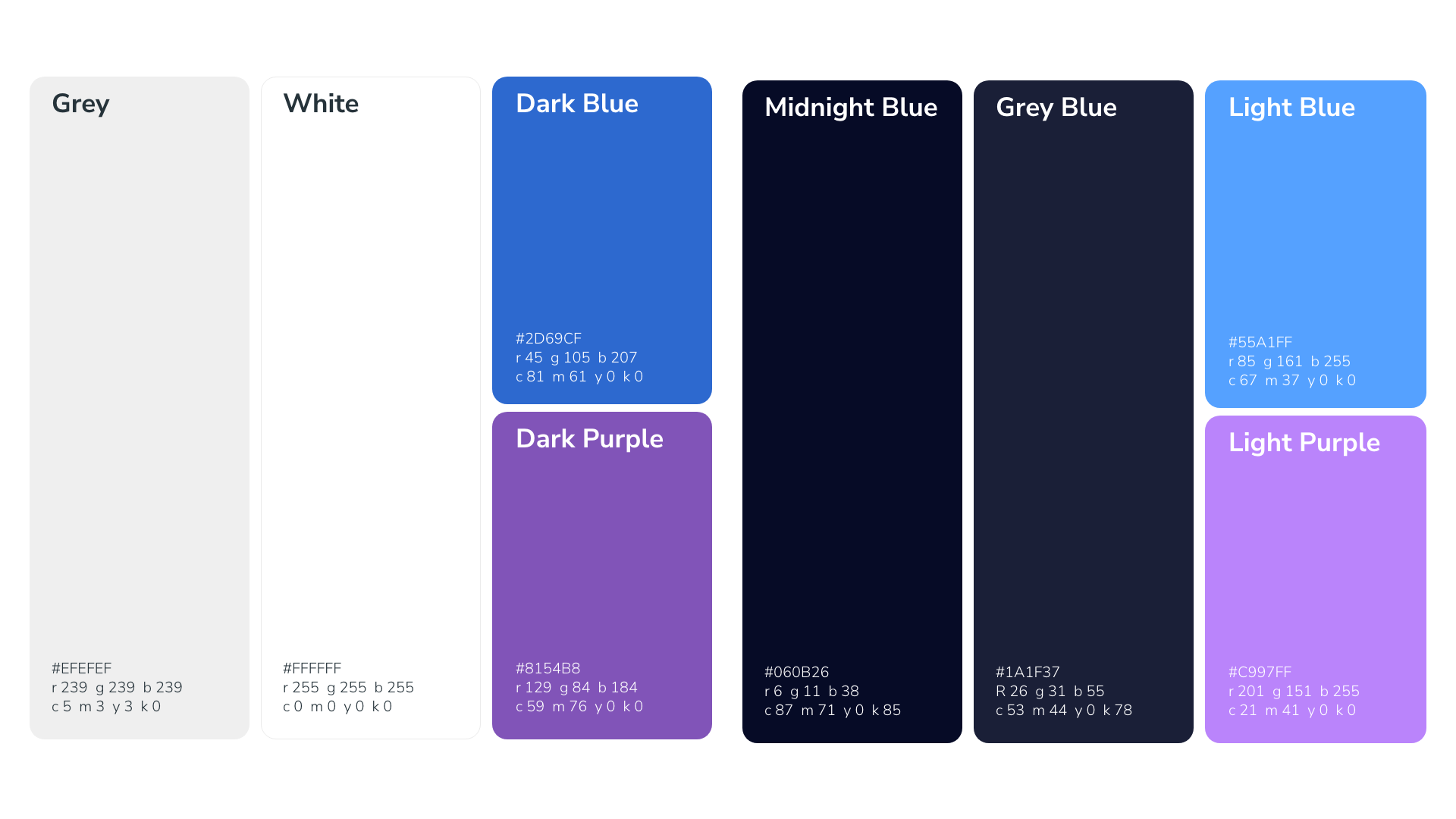
Two primary colour palettes; as the brand portal must be accessible in both light and dark modes. Ensuring enough colour contrast across all material improves accessibility
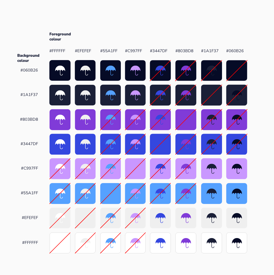
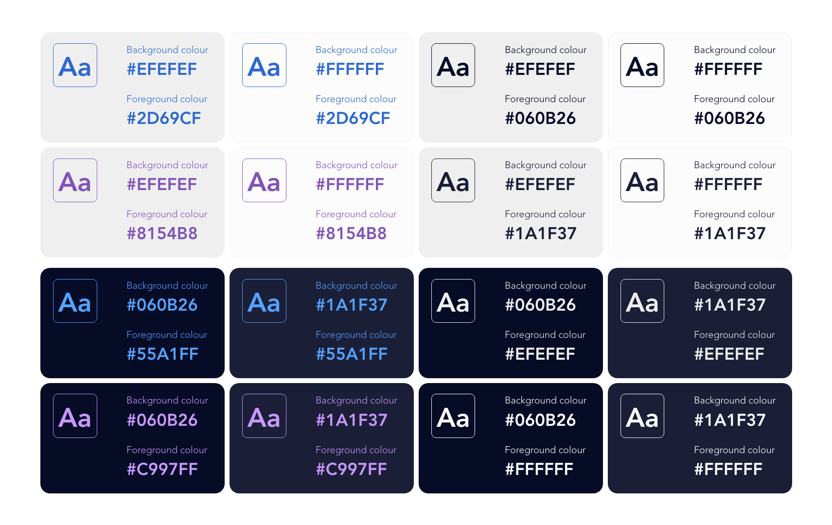
The table below defines approved foreground and background colour pairings. These are the only combinations that should be used for text, icons, UI components, or essential brand elements.
The table below defines approved foreground and background colour pairings. These are the only combinations that should be used for text, icons, UI components, or essential brand elements.
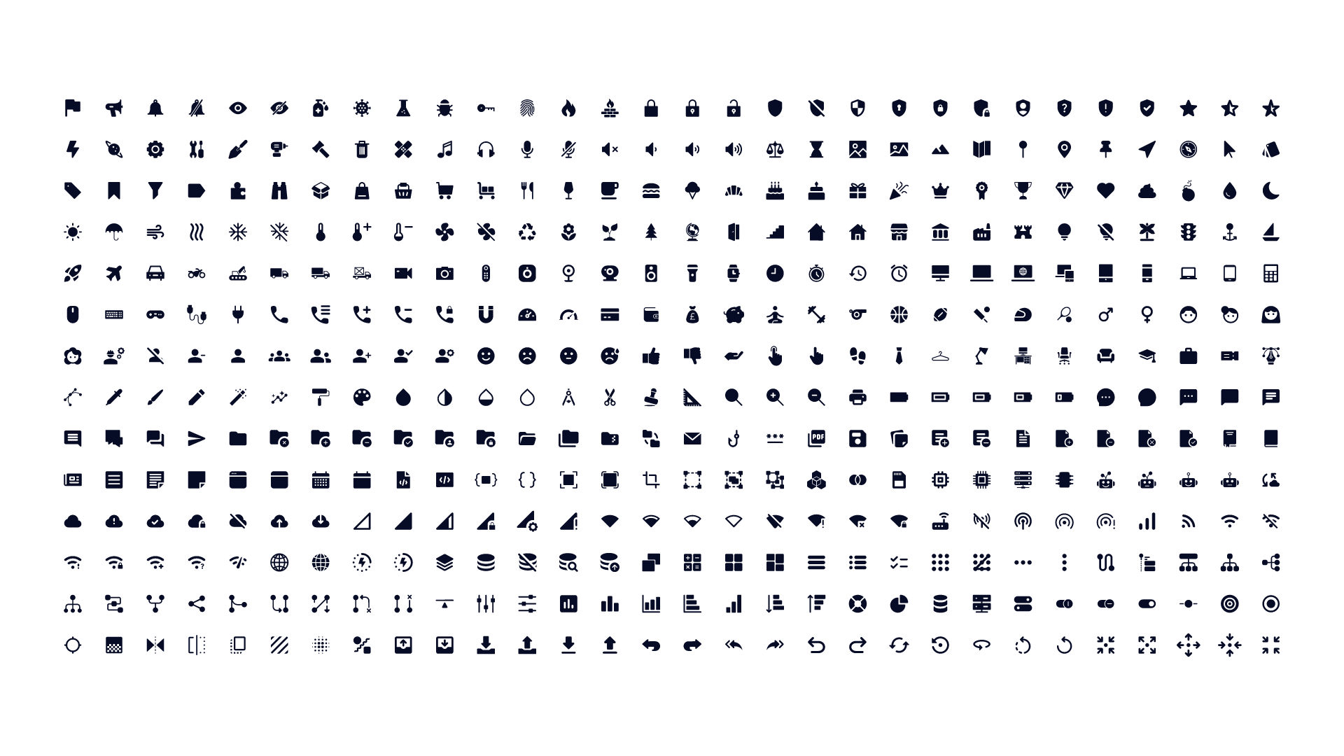
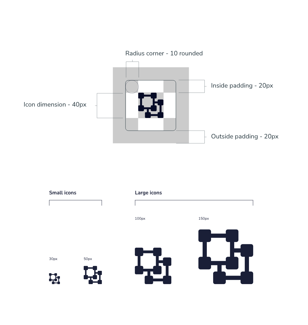
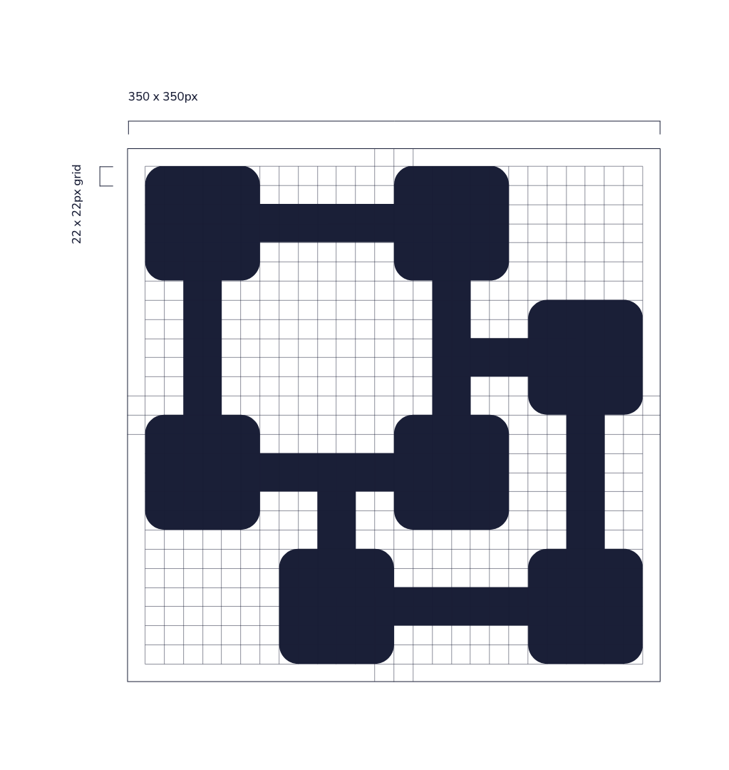
I designed a specific icon library to be used on the portal to allow brand consistency and to accessibility